
The user has the option to chart grid data he wants and to have chart shown next to the chosen grid.
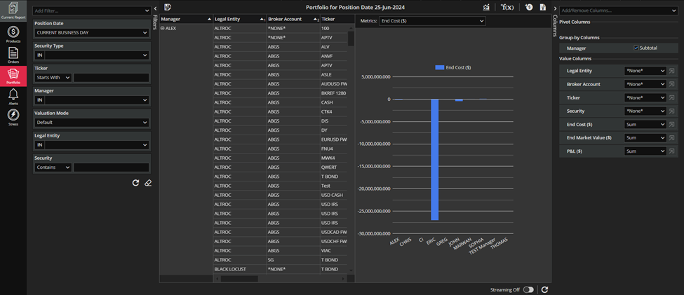
Charting is available from the icon in the report`s toolbar as shown in the screenshot below.
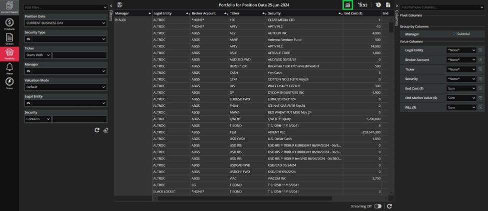
The button SHOW CHART is accessible in the pinned report`s toolbar, in the existing report`s toolbar as well as in the toolbar of the report that you just created yourself.
As soon as the chart is added to the grid-view, the SHOW CHART icon should turn into a HIDE CHART icon (as in the screenshot below).
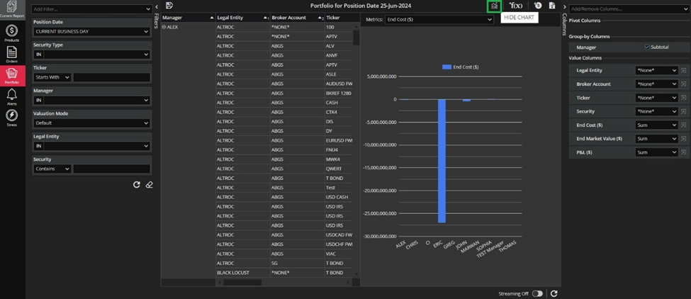
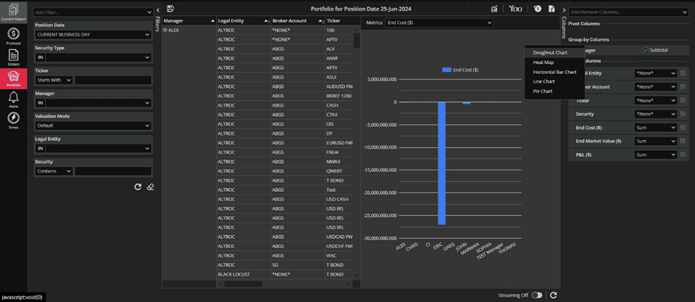
The Vertical Bar Chart is default chart graph type, but chart type can be changed via right click on the chart area after the chart is successfully initialized for the first time.
When opening the chart for the first time if Subtotal for the first grouping column in unchecked, the user is will be prompted with a question if we should show the subtotal.
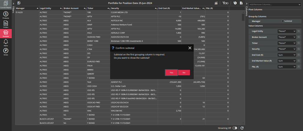
If the user says YES the Subtotal for the first grouping column will be checked and the chart will appear. On the other hand, if the user says NO nothing will happen and he will have to check Subtotal manually to be able to create the chart.
When opening the chart for the first time – the first available metric will be selected by default.
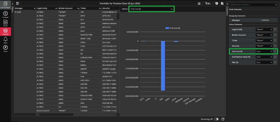
The metric can be selected using a select box (multi-pick) for Vertical/Horizontal Bar Chart and the Line Chart. Also, metric can be picked via combo box for a Doughnut Chart or two combo boxes (Size Metric and Color Metric) for the Heat Map Chart.
The order of available metrics is alphabetical, i.e. different from the order of columns in the grid and Columns curtain.
Available metrics are:
- Number and Date type columns for Vertical/Horizontal Bar Chart and the Line Chart;
- Number and Boolean type columns for the Doughnut Chart ;
- Number type columns for the Heat Map size metric and Number and Date type columns for the Heat Map color metric.
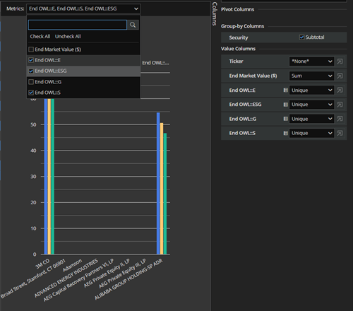
In the case where we chart multiple values in the same bar chart, we can select in what order the values should be displayed in the chart regardless of the order of the metrics in the Metrics drop-down menu. For example we select End OWL::E, End OWL::S and End OWL::ESG, respectively (see screenshots below).
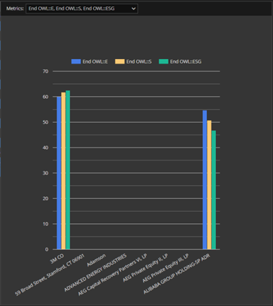
If you change column aggregation (in the Columns curtain or in the column definition) then the change you make will be visible on the chart as you can see in the screenshot below.
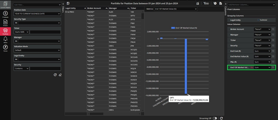
When the chart is closed, after reopening – the state will be restored as much as possible because some columns are possibly no longer available as metrics.
Metrics control(s) should be disabled when there are no metrics to pick from.
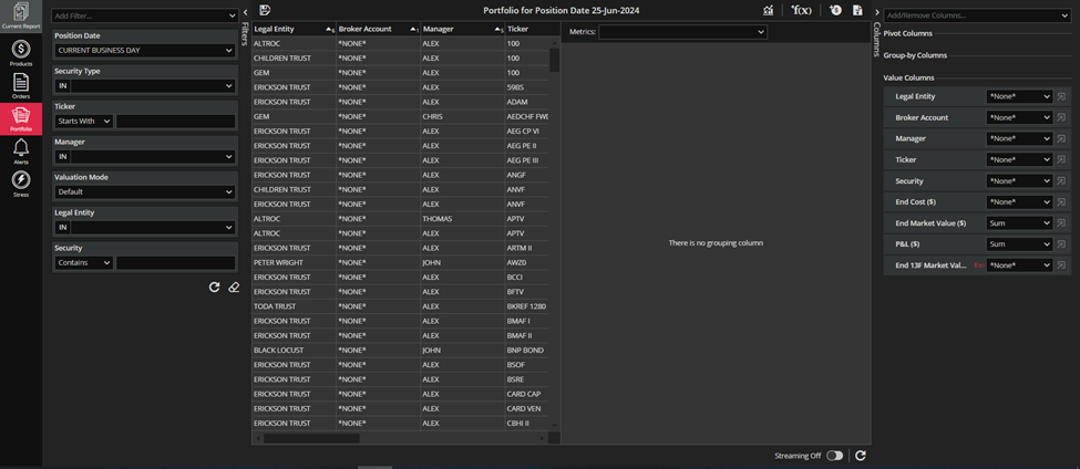
If there is no grouping column then “There is no grouping column” message will appear in the chart area.
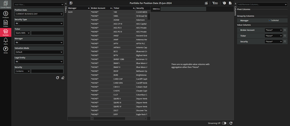
It can happen that you have a grouping column and Subtotal is checked but you do not have applicable value columns with aggregation other than *None*. In that case, a corresponding message will appear in the chart section as you can see in the screenshot below.
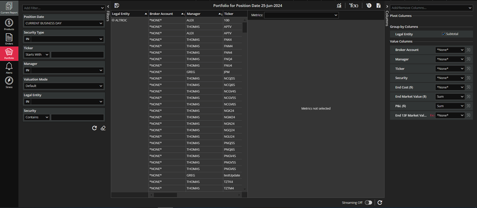
If you remove a column that was originally selected for a metric then message “Metrics not selected” will appear.
It should be mentioned that when the streaming is on, the chart refreshes every time the grid refreshes.
Finally, you can create your report, choose the chart you want and save it. Charted report supports saving as any other report. A saved report preserves chart-related settings and changes regarding the chart (shown state, chart type, selected metrics).
